How the orange haze of Blade Runner 2049’s Las Vegas meant 13 hour renders
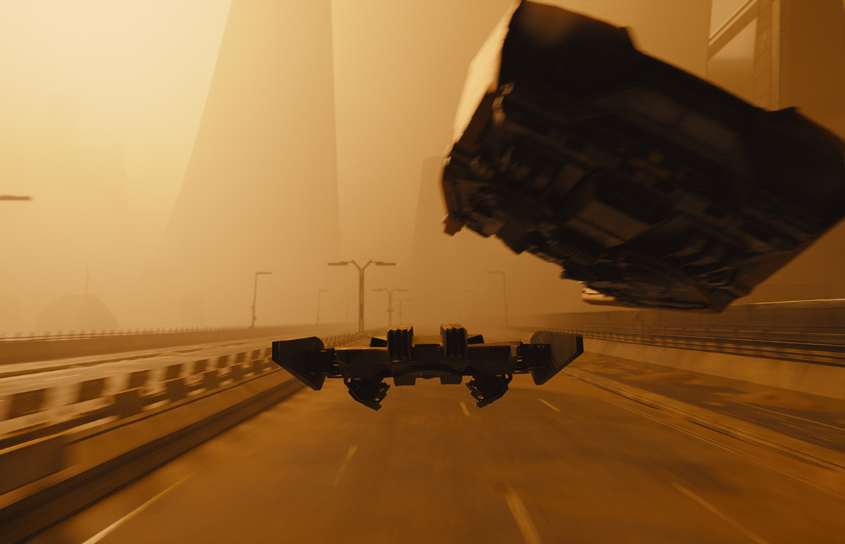
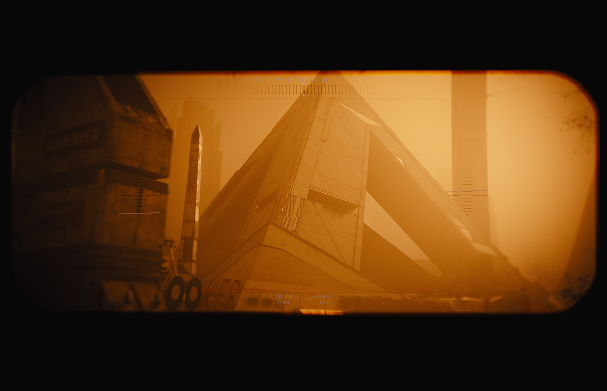
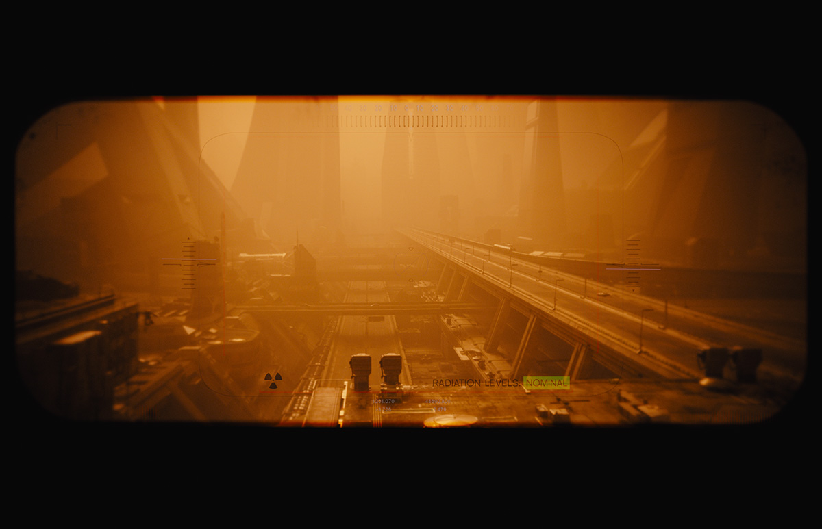
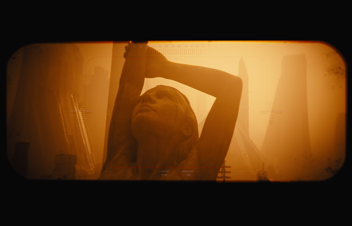
Some of the most visually startling moments in Denis Villeneuve’s Blade Runner 2049 are the distinctively orange and hazy Las Vegas scenes. The look for these was said to be inspired by a rare Sydney sandstorm (one that I remember living through).
Academy Award nominee Richard R. Hoover was Framestore’s visual effects supervisor on Blade Runner 2049. The other nominees for the film in the visual effects category are John Nelson, Gerd Nefzer and Paul Lambert. Here, Hoover discusses how getting that orange tinge proved more difficult than first thought, and how making the city look realistic proved even harder.
I talked to Richard at SIGGRAPH Asia 2017 in Bangkok. The conference is in Tokyo in 2018.
The first big speed bump was, we got Vegas all together, we got it all procedurally textured, and we looked at it and it didn’t look real. The only question in my mind was, ‘Well, how do I convince my director and my producers that we’ve done everything we can to make it real?’ The only way to do that was to be able to do a side by side comparison between something that was real, out of that material, and what we were rendering.
You can’t really do that orange light in sandstorm. So my rational was to not render it in the sandstorm, but to render it with natural white light, and compare that to something that was tangible and that we believed was real. When we can get those two things to be the same, or feel the same, then we would add the orange filter and we would add the sand, and it would be what it is.
The idea of the human scale helped enormously in getting to realism by adding in remnants of human life, like tables and chairs, even though, in the end, you didn’t see a lot of it. It grounded your perception of what it was to be able to say, ‘Okay, yeah, I think it looks real now.’ Without it, it was impossible.
Another challenge was not having many windows on the buildings, a throwback to designer Syd Mead’s original artwork. Denis felt that the simple geometric shapes, particularly that Syd Mead diagonal that’s common in all his building designs covered in as a big, monolithic piece of concrete, represented the mood, feel, and style of the film. It felt brutal, simplistic. So when that became applied to everything, everything looked the same. Everything. So that, on top of the fact that it was all heavily comforting to be simplistic in colour, left us with this feeling of it not being real. So we had to find a way to put enough details in there to believe it.
What also helped was the addition of volumetric rendering of the atmosphere, which we actually did twice. It helped make everything look more hazy and realistic, but it was also part of Denis’ storytelling of only allowing the audience to see so much, and allowing you to see when he wanted you to see it. So, if he didn’t want you to see too much, we made the atmosphere heavier. He didn’t want you to see certain aspects, he was really directing your eye to see what he wanted you to see. The renders were expensive, particularly to do two different ones, but it also hid a lot.
One of our drone shots was originally over 1,000 frames long and it took 13 hours to render with that volumetric haze. In the comp, there’s a lens treatment that goes on that distorts the image when the lens rotates from one to the next. That did give us a bridge, so we could break up the renders into parts in the end. Denis ended up using it to shorten the sequence.